M01vs. the previous flow, measured on the same cohort
38%
Onboarding completion lift
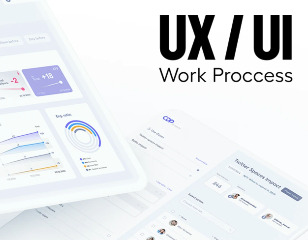
Bank Hapoalim's youth segment is the kind of audience that will close a banking app inside three taps if it asks them to read anything.
The brief was to redesign the existing mobile app for users between 14 and 21 — a group that had been treated as a smaller, simpler version of the adult product and was, predictably, abandoning it. We approached the engagement as a re-cut rather than a rebrand: the bank's compliance constraints were not negotiable, the underlying APIs were not changing, and the visual identity had to remain unmistakably Hapoalim. Every other surface was on the table. We rebuilt onboarding around a single decision per screen, replaced the dashboard with a feed-style timeline that put the day's spending and the week's goal at eye level, and rewrote every microcopy line from the perspective of someone who has never opened a paper bank statement. The motion language was tuned to feel responsive rather than playful — animations carry information, not decoration. The result was an app that the segment actually opened, used, and reviewed positively, without reducing the bank's brand surface area or its compliance posture.
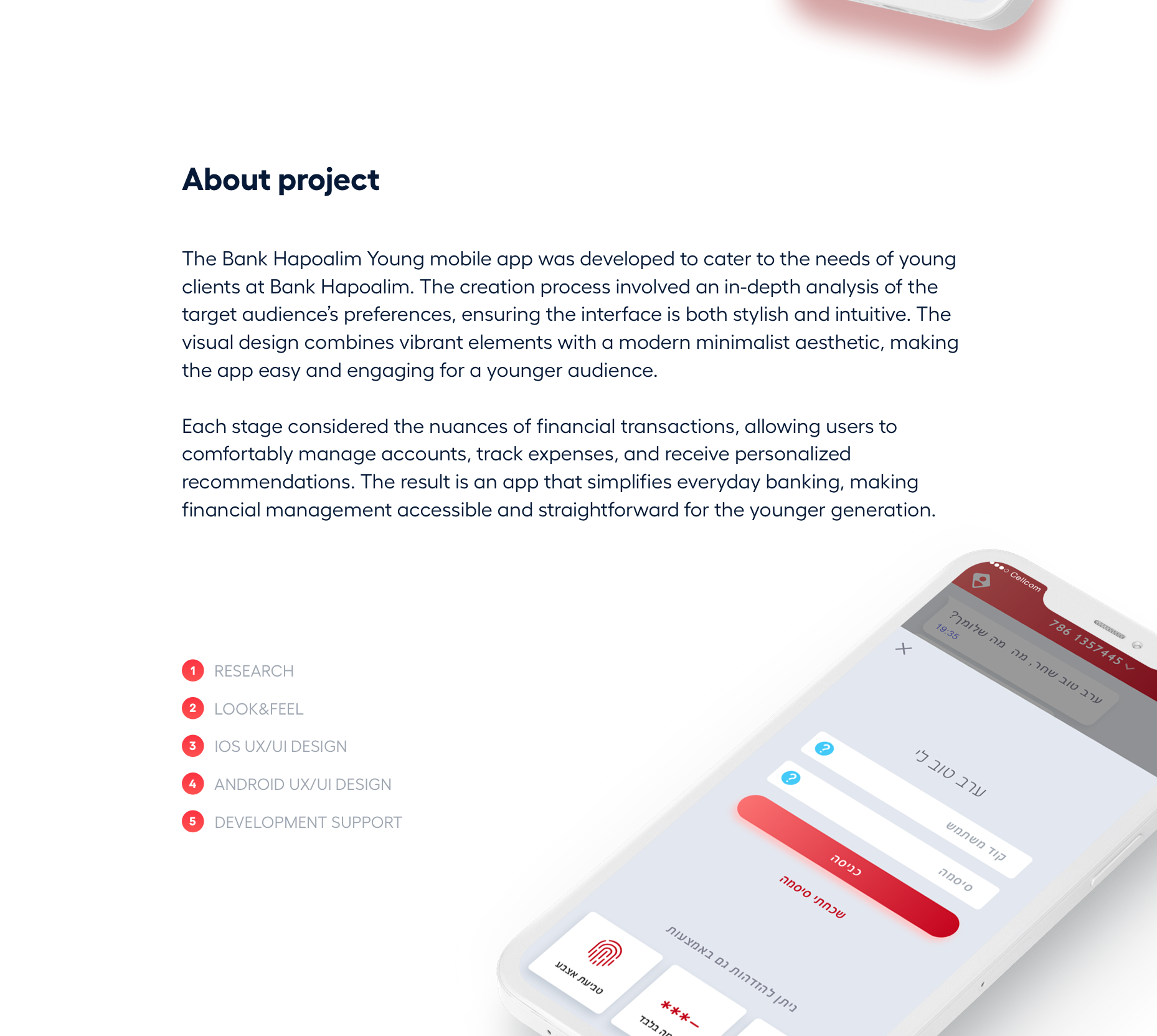
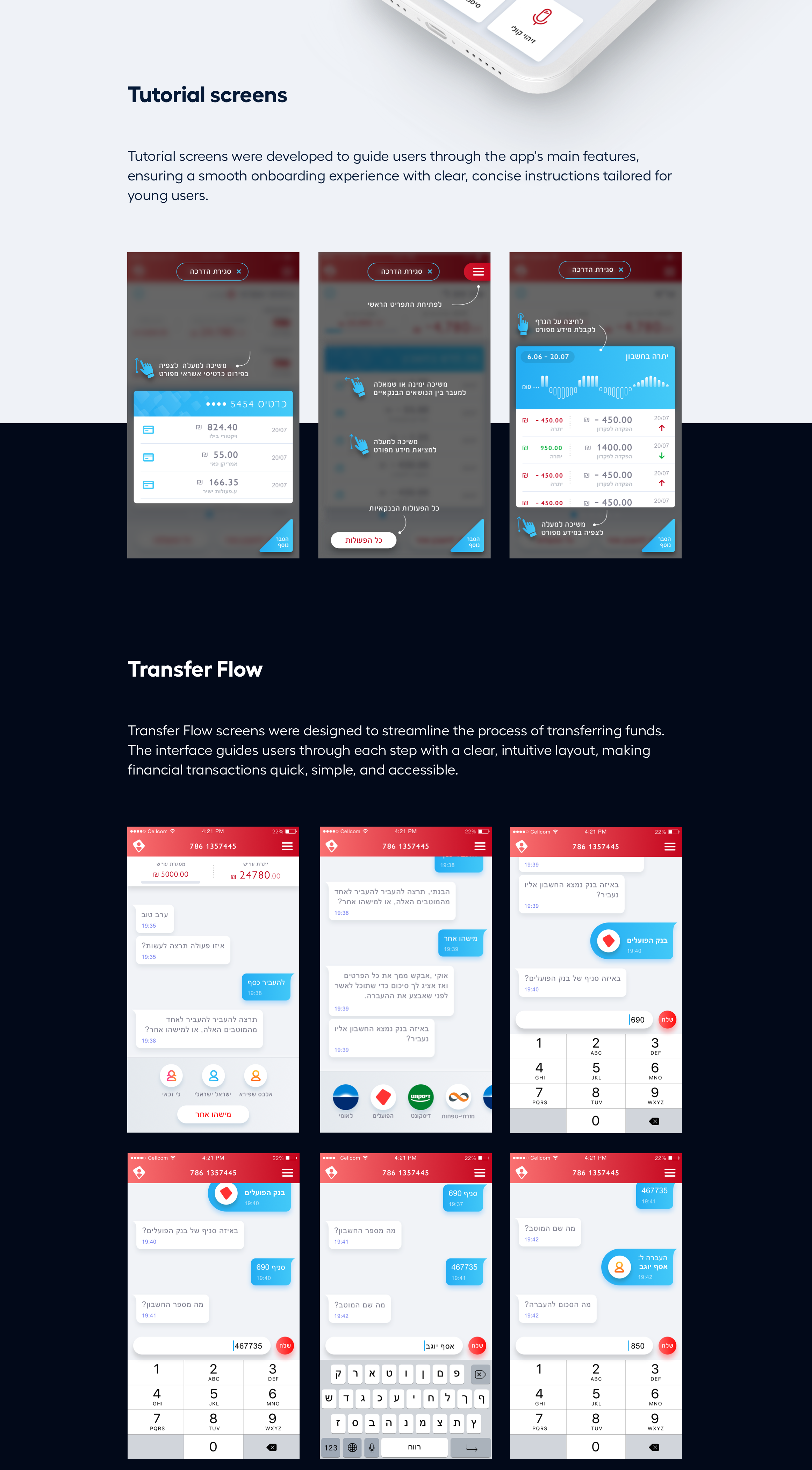
Onboarding was the highest-friction surface and the lowest-tolerance audience, so we treated it as a sequence of single-decision moments. Each screen asked exactly one thing of the user, presented one piece of information, and gave one path forward. No multi-field forms, no compound legal acceptances, no skippable explainers. The bank's compliance team signed off on the result by re-deriving the legal coverage from the sequence of acknowledgements rather than collapsing them into a wall of checkboxes — a small but consequential procedural shift.
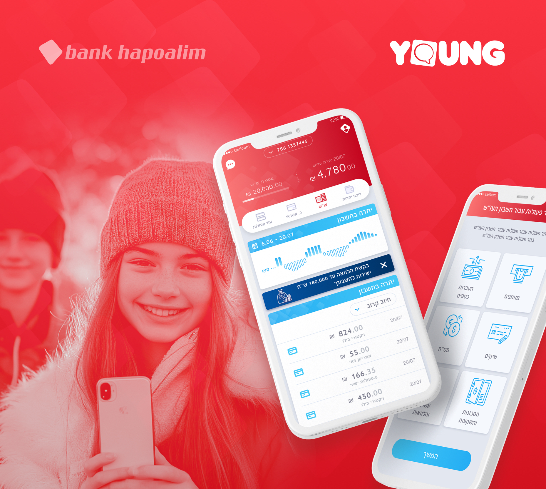
Adult banking dashboards are designed to surface as much account state as possible at once. Youth users do not want that — they want to know what just happened and what their week looks like. The redesigned home screen is a chronological feed: today's spending at the top, the week's running goal underneath, then transactions and notifications interleaved as they occurred. Account state is one tap away, not zero, and that trade was net positive on every metric we tracked.
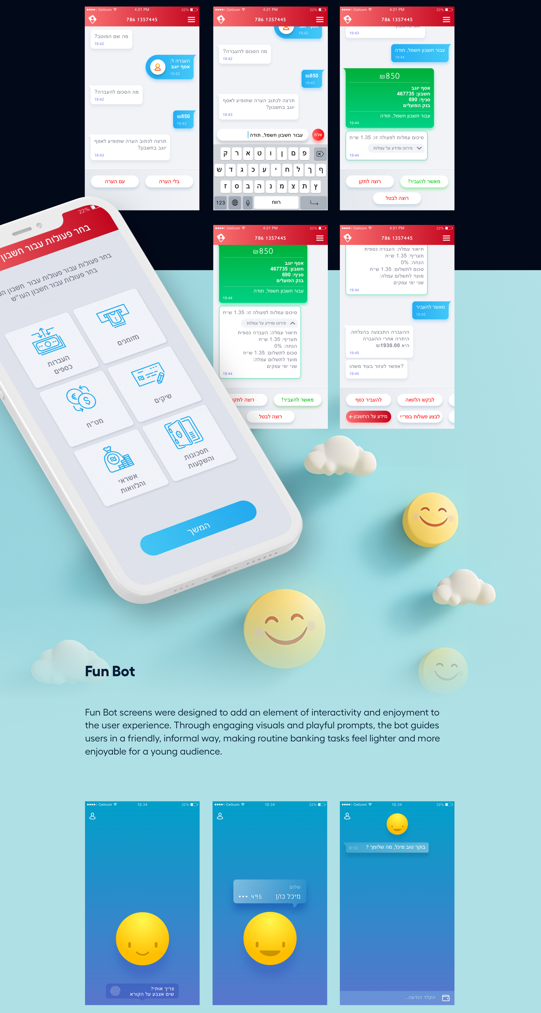
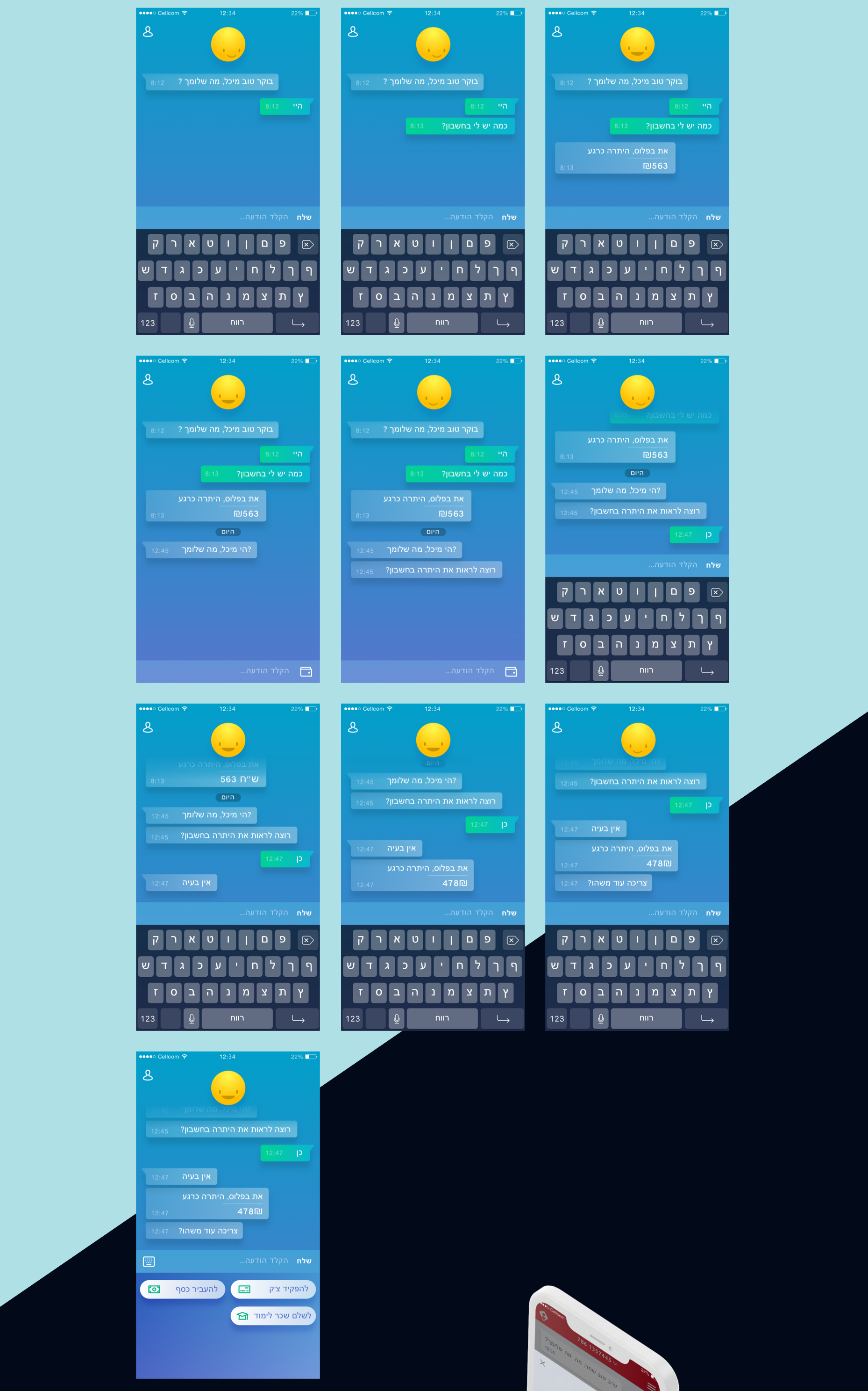
Every line of text in the app was rewritten from a single voice document — direct, unornamented, no banking jargon, no second-person condescension. We treated microcopy as the most consequential brand surface in the product because it is the only one users are forced to read. The bank's brand team participated in the rewrite, and the resulting voice is now applied beyond the youth segment.
Animations were reduced to three families — list reveal, value transition, and confirmation pulse — each tied to a specific informational role. Decorative motion was removed entirely. The result feels modern without feeling performative, which was exactly the brief: the segment is sensitive to anything that reads as 'made for them' in a patronising way.
Onboarding completion lift
Daily active sessions
App-store rating
Send a short brief — we'll reply with concrete next steps. New engagements are limited each quarter.