M01carrying every customer-facing surface
1
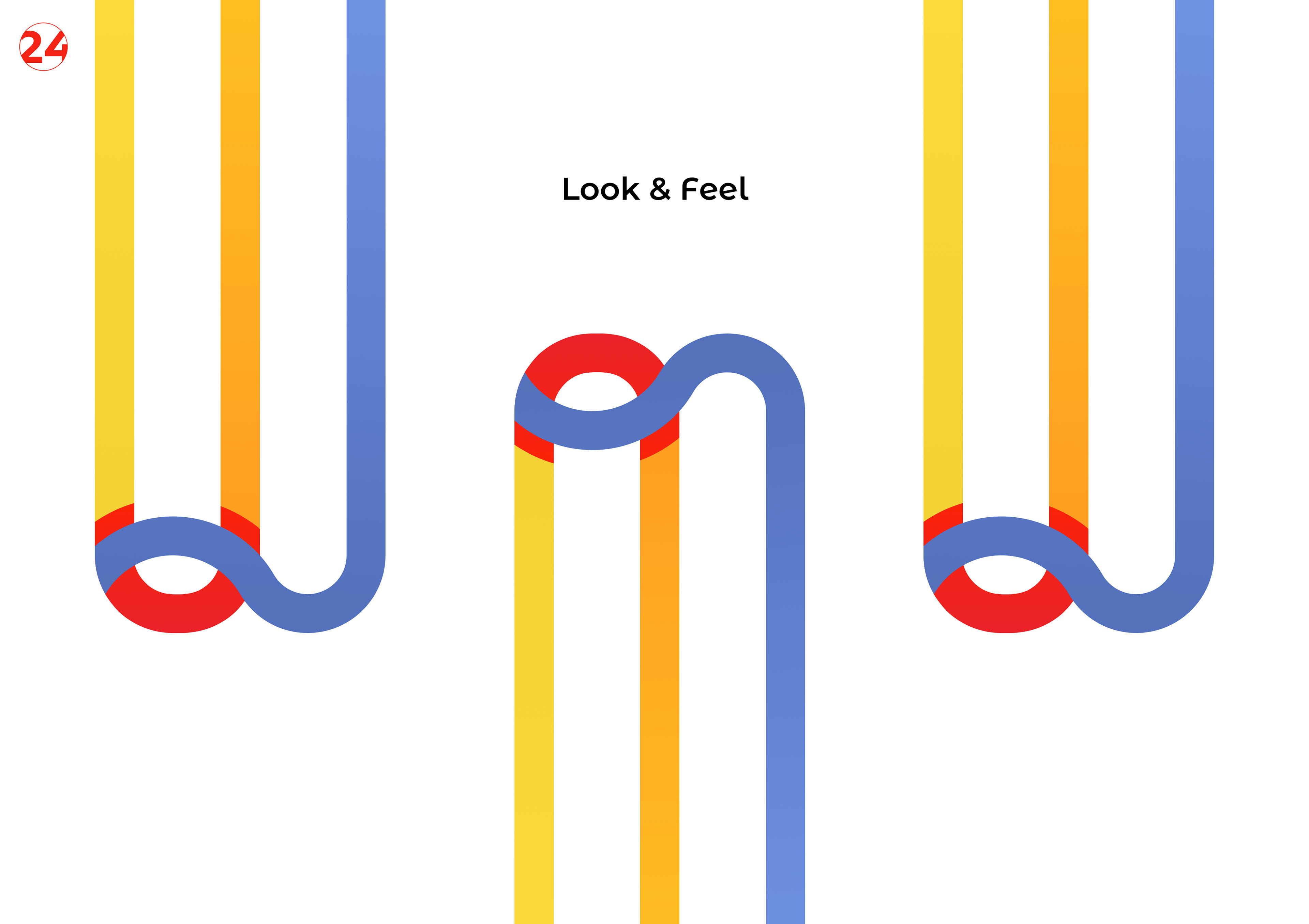
Visual system
Winky operates in a category with no clear incumbent worth imitating, which is the most useful kind of brand brief and also the riskiest.
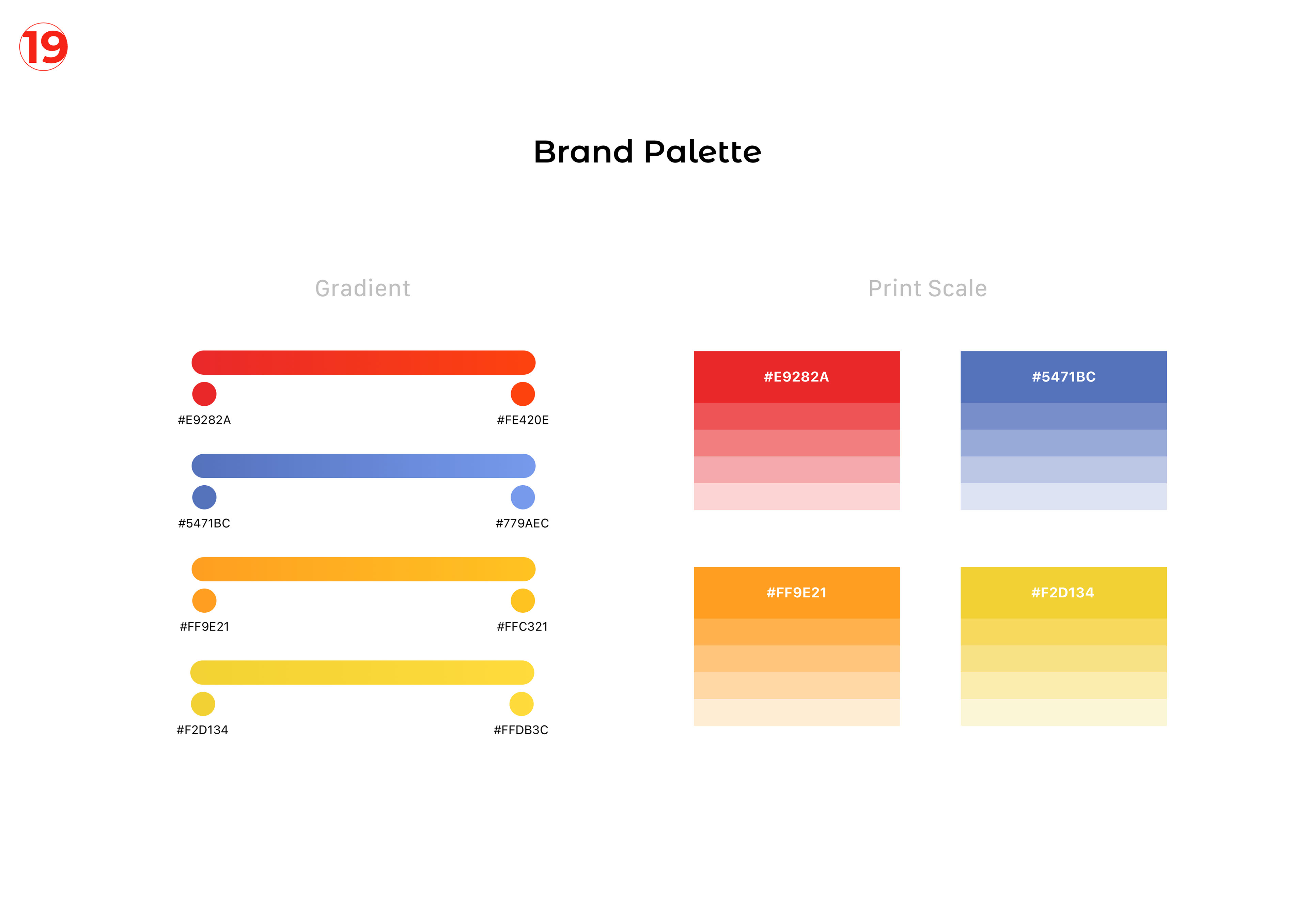
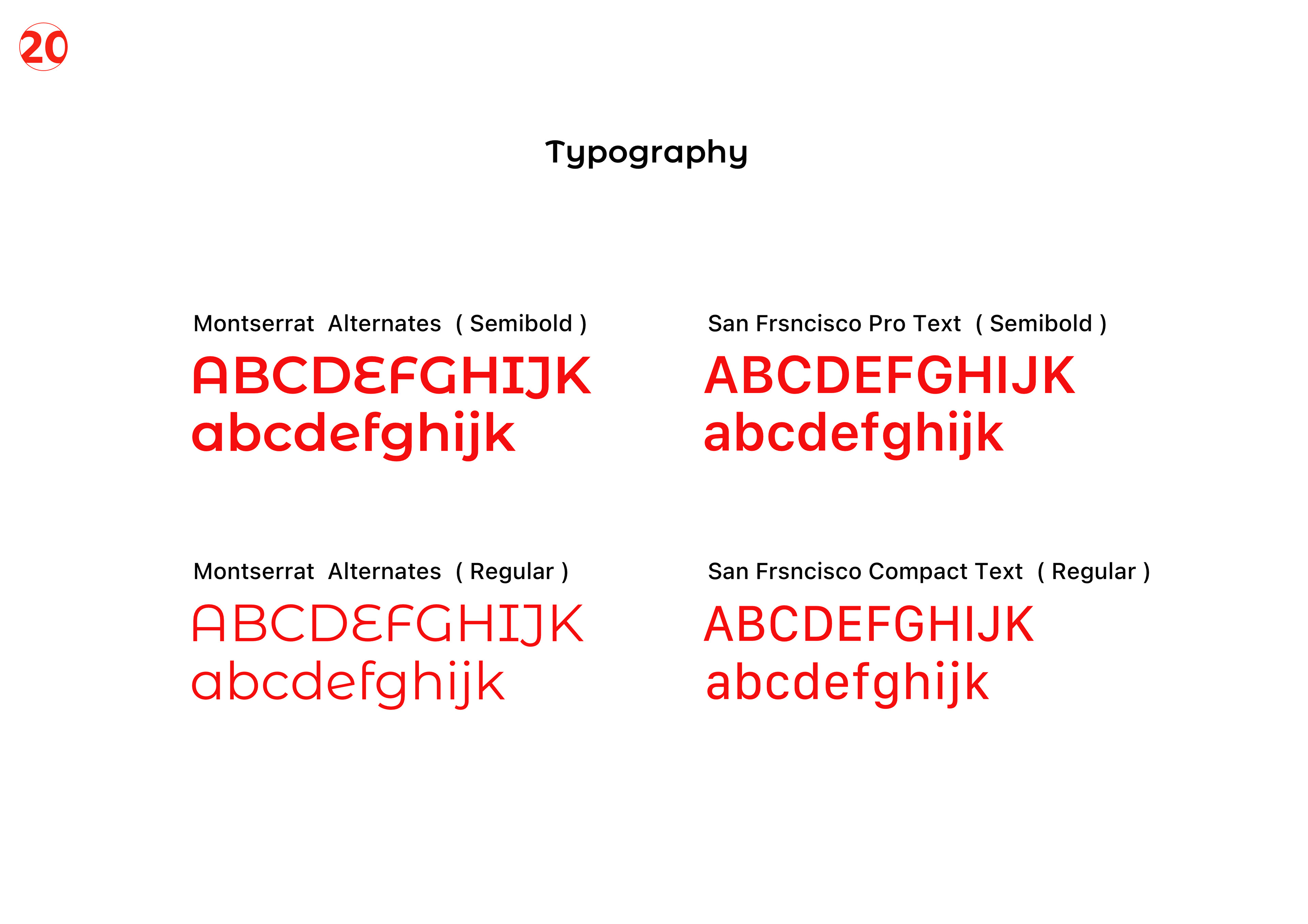
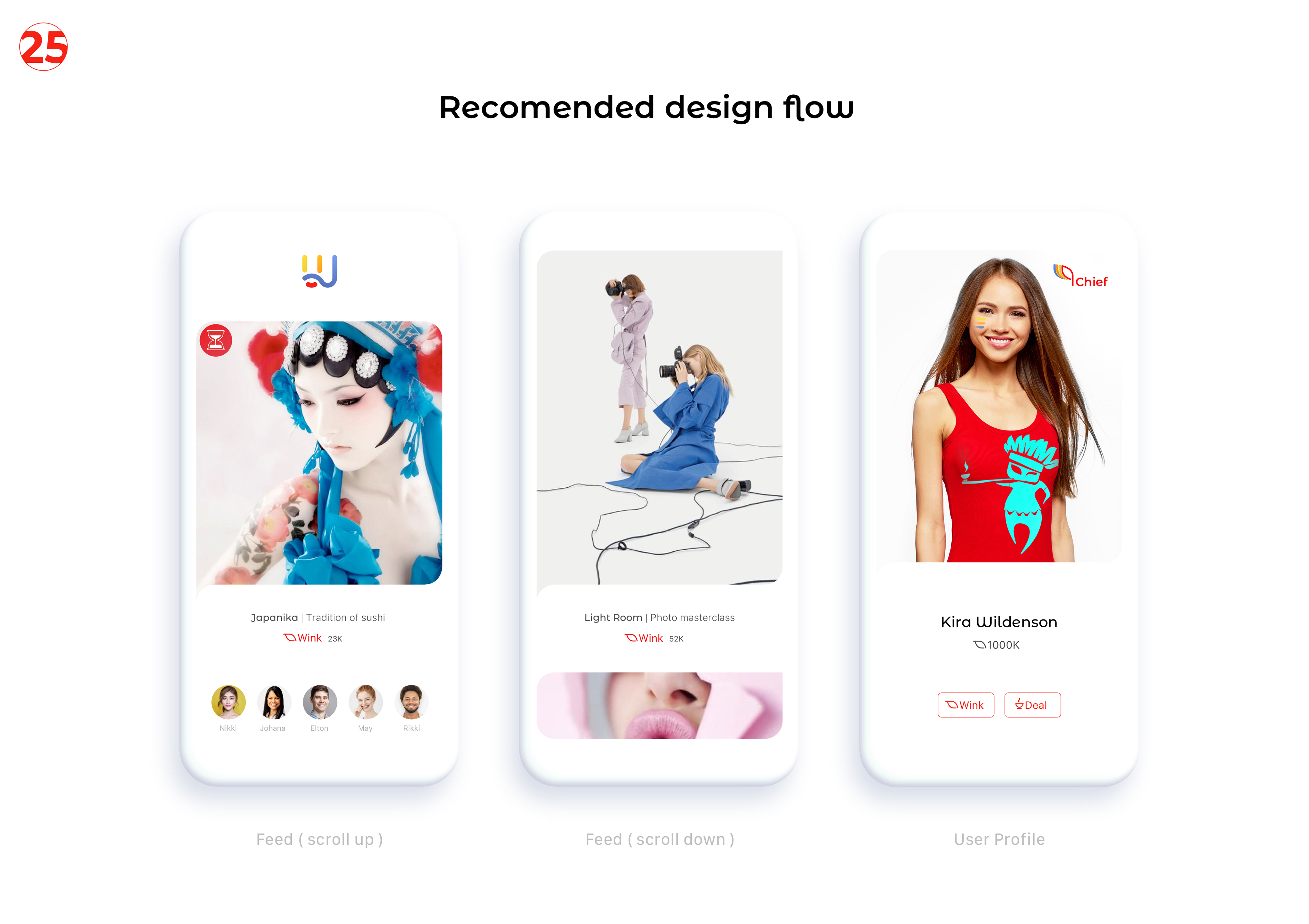
The brief was an identity system that would not flinch in a category that has not yet decided what it looks like. We anchored the system on a custom wordmark, a single typographic voice, a constrained palette, and a photography direction that did not borrow from any adjacent segment. The deliverable is a 26-spread brand book — short enough to be read, long enough to be operated — and a small set of working files that the team applies without supervision.
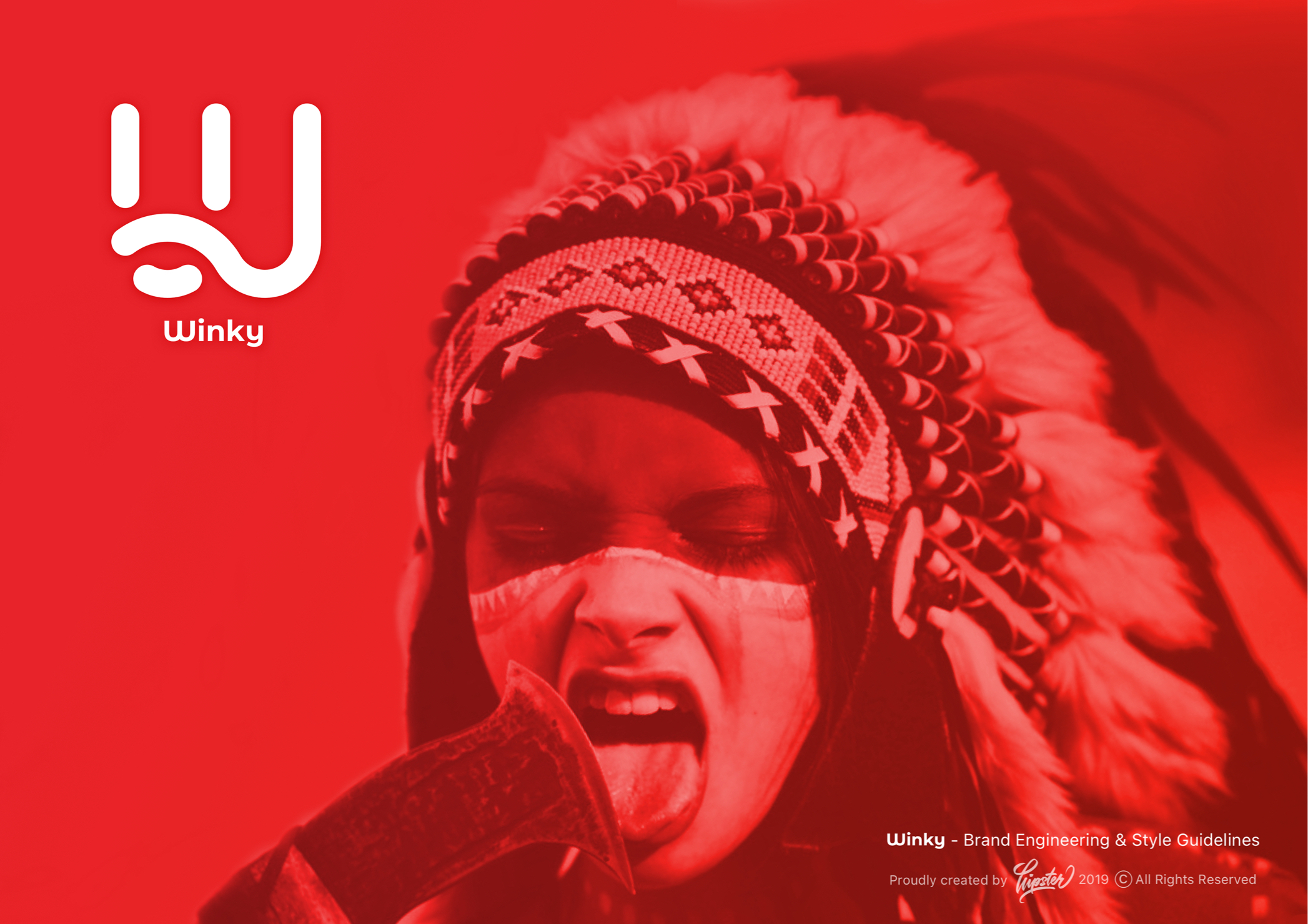
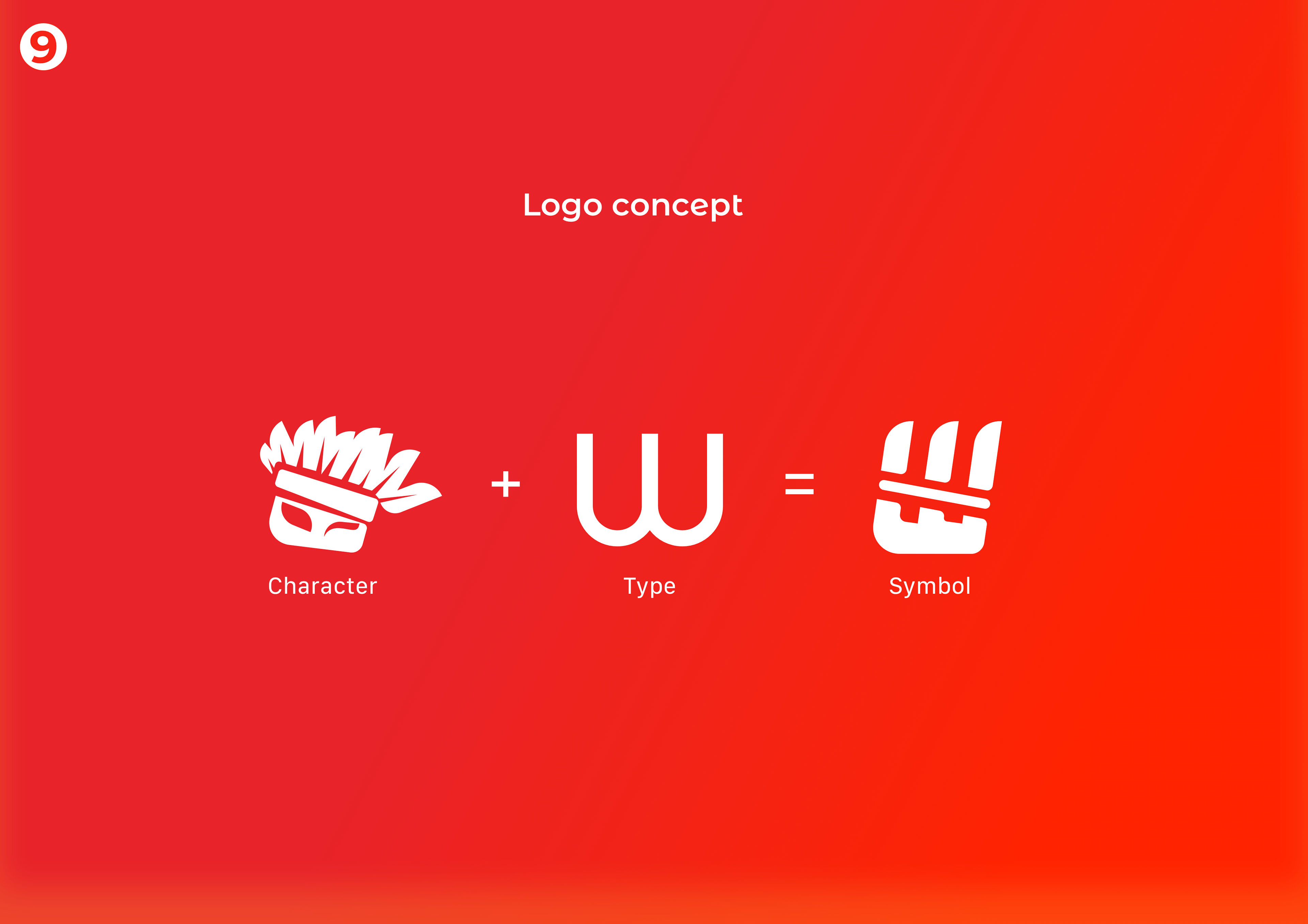
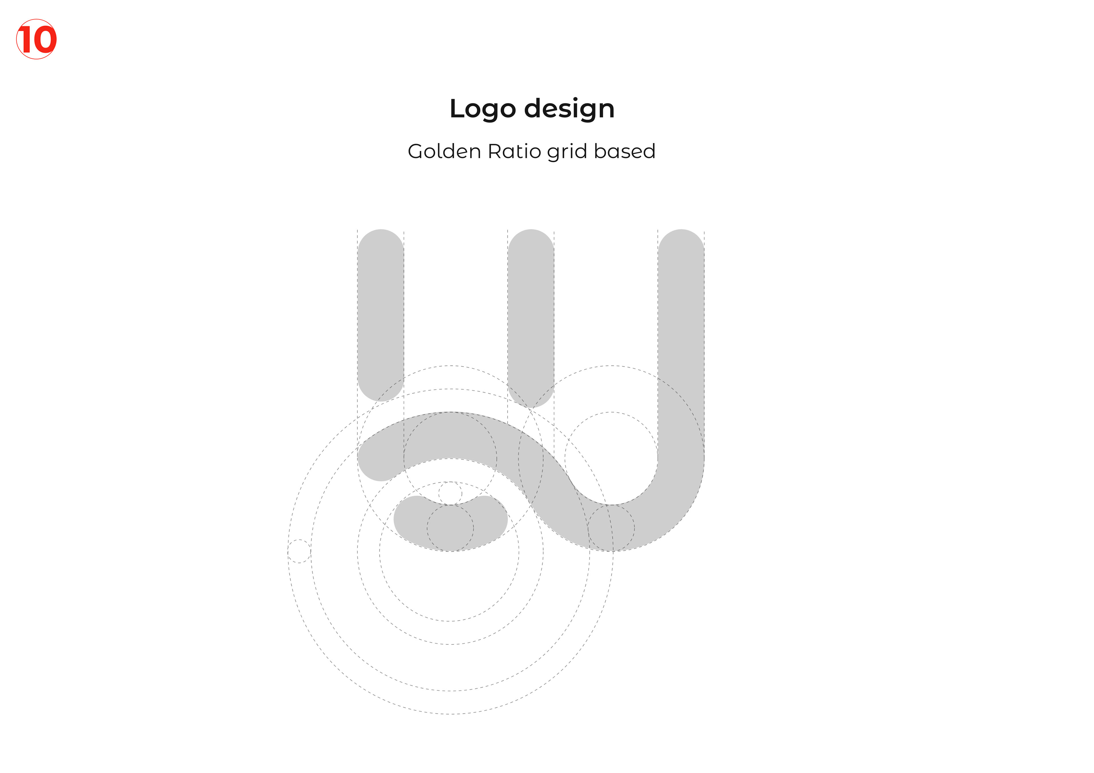
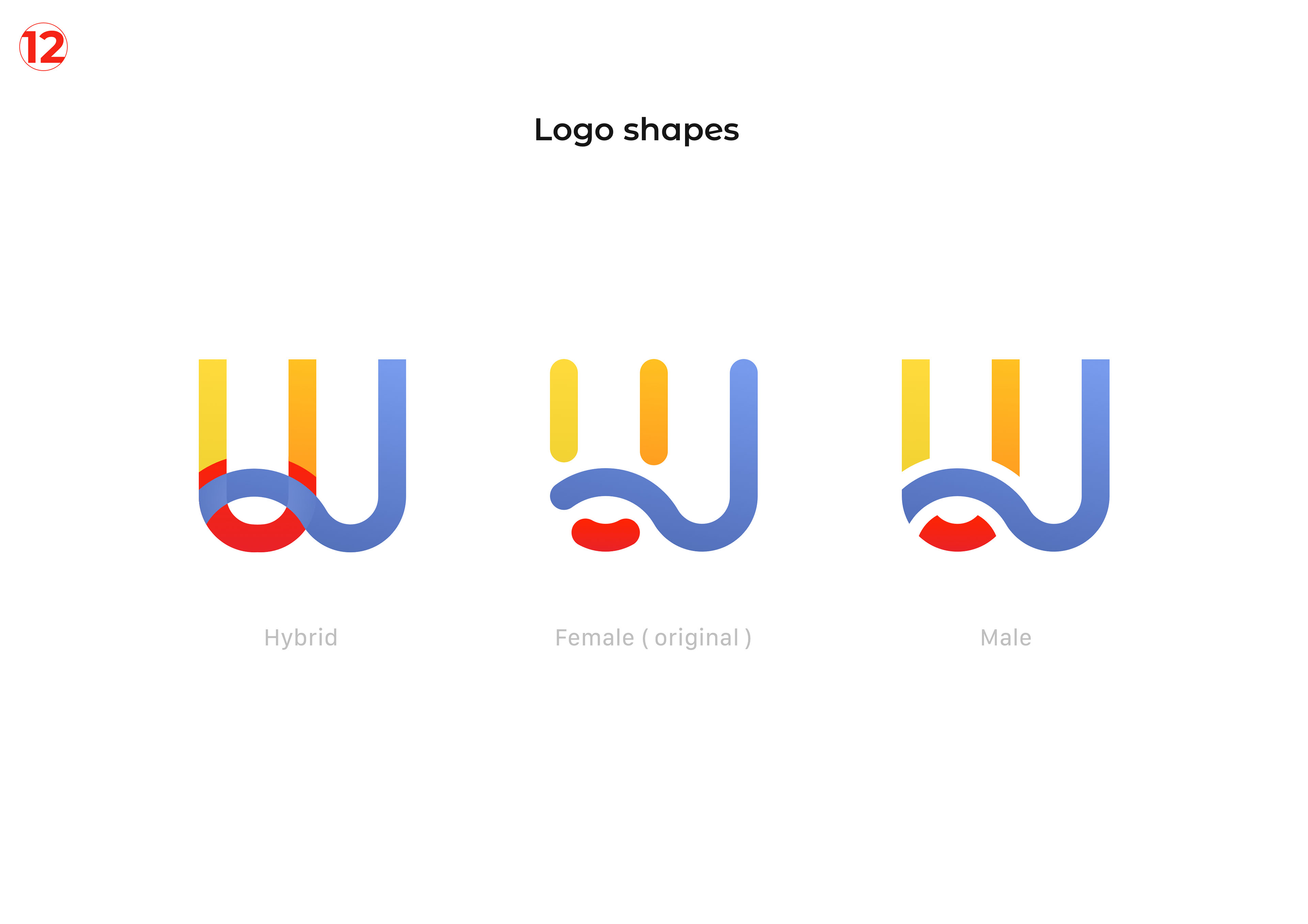
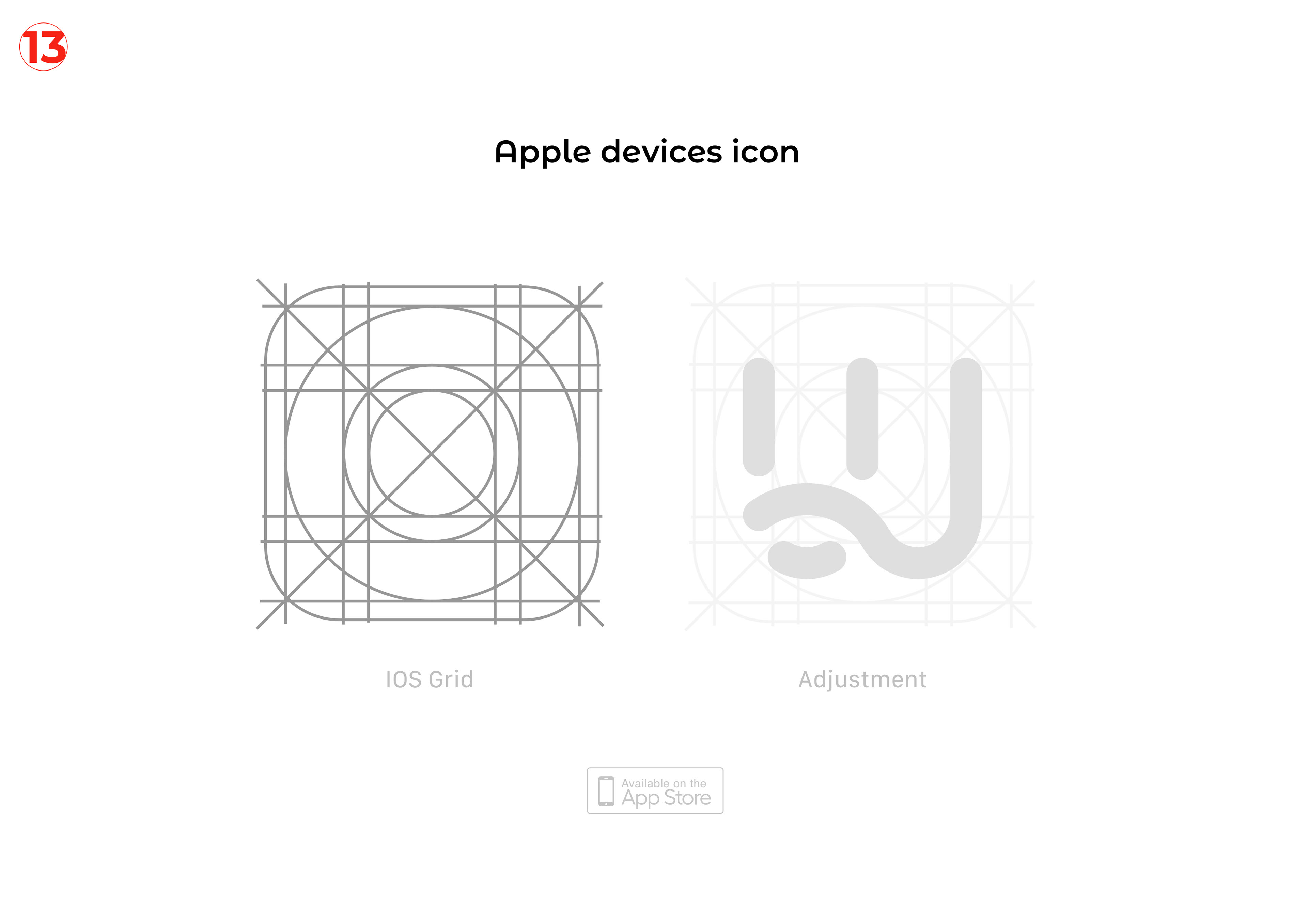
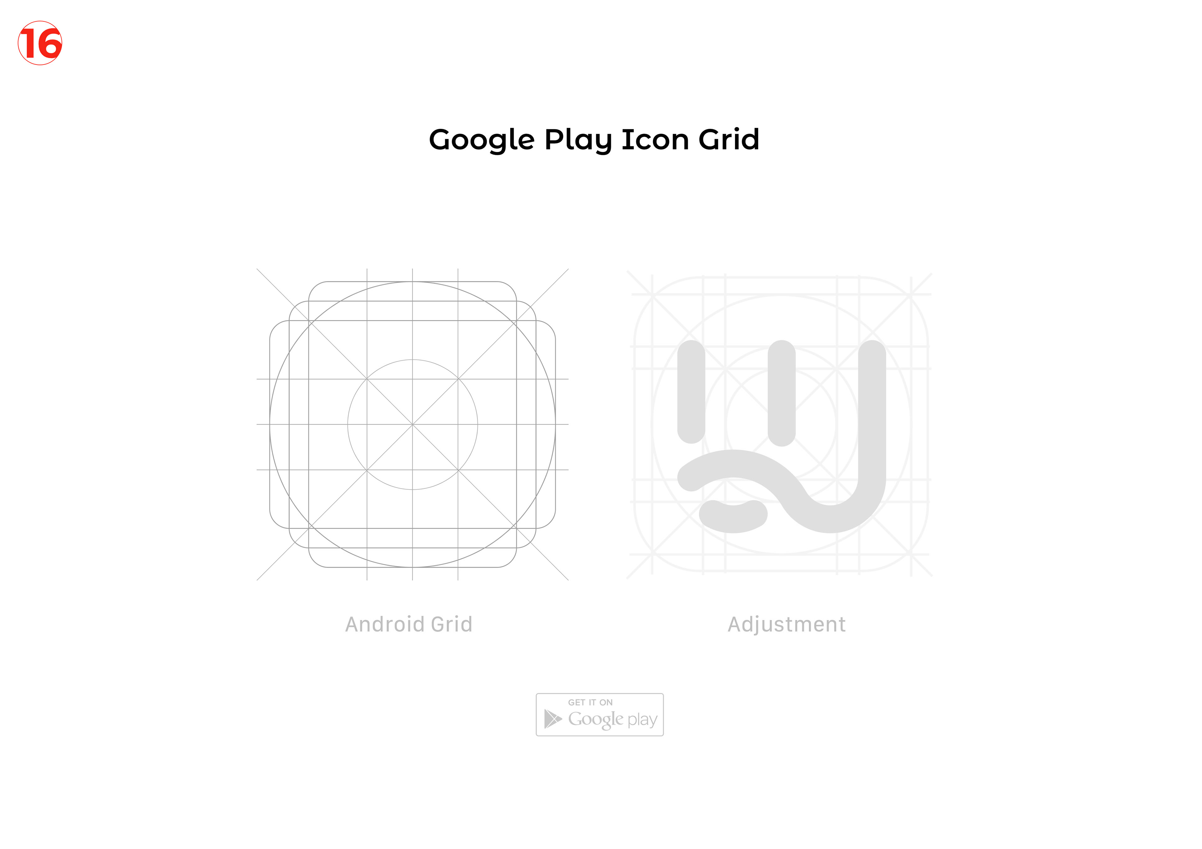
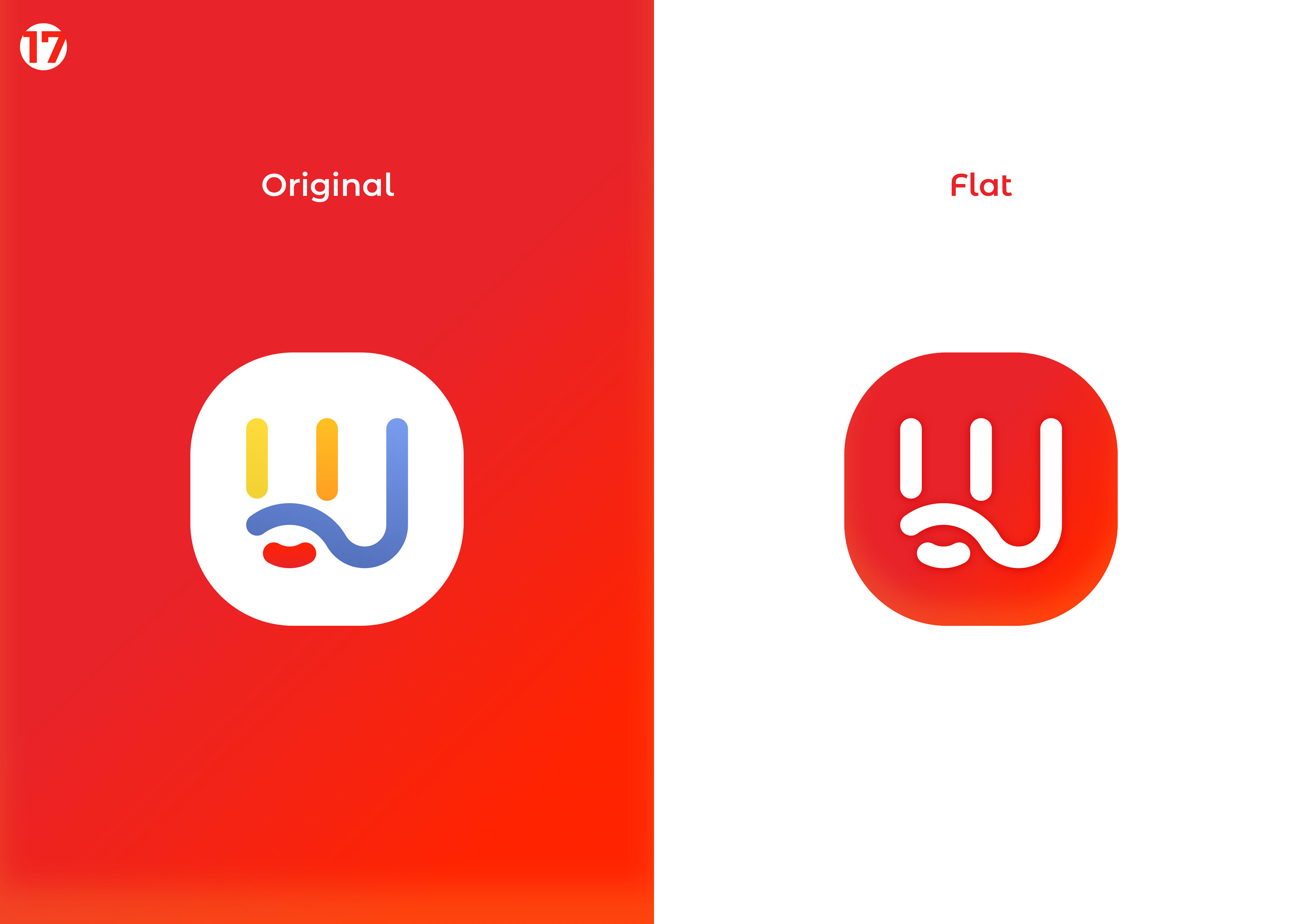
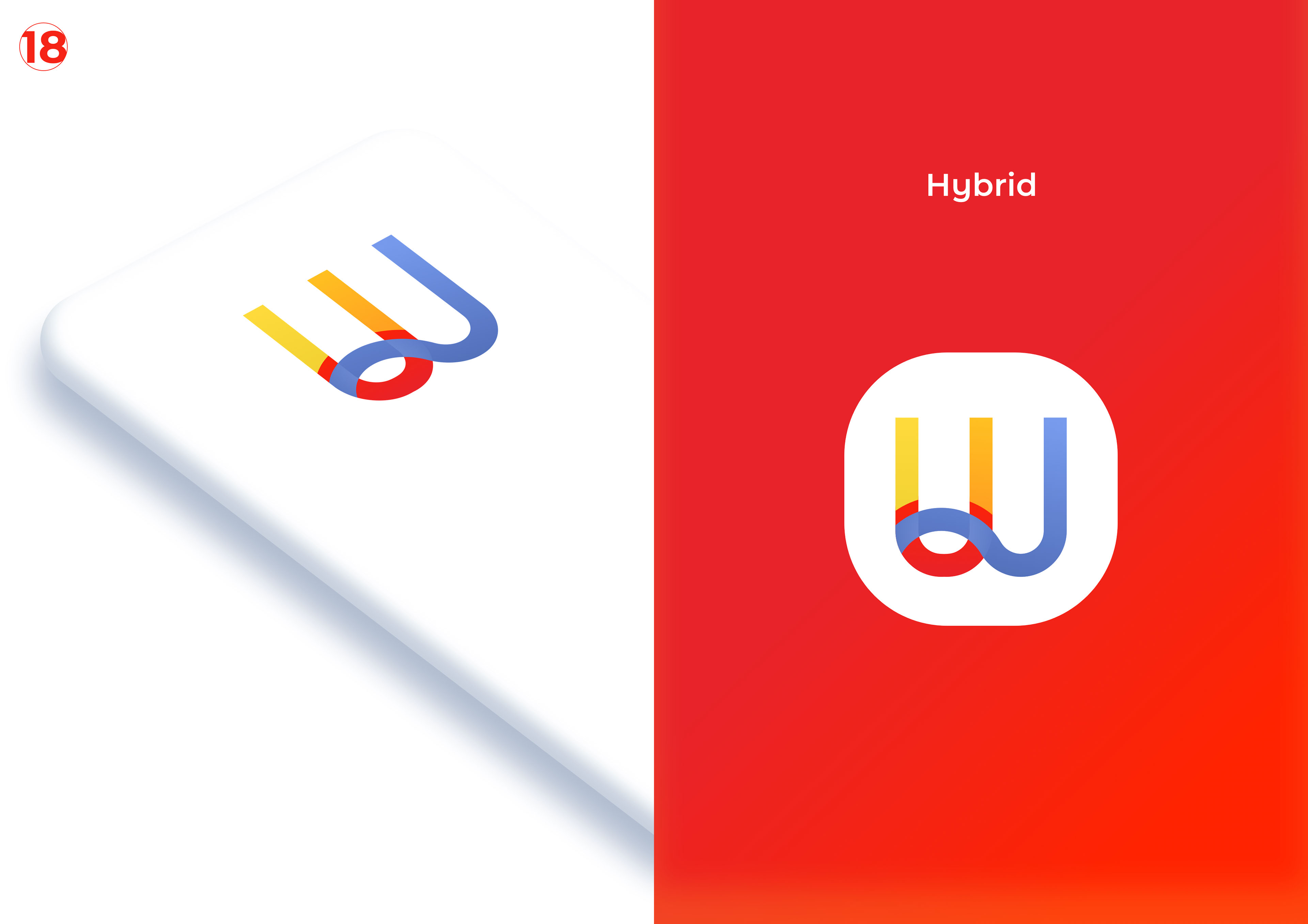
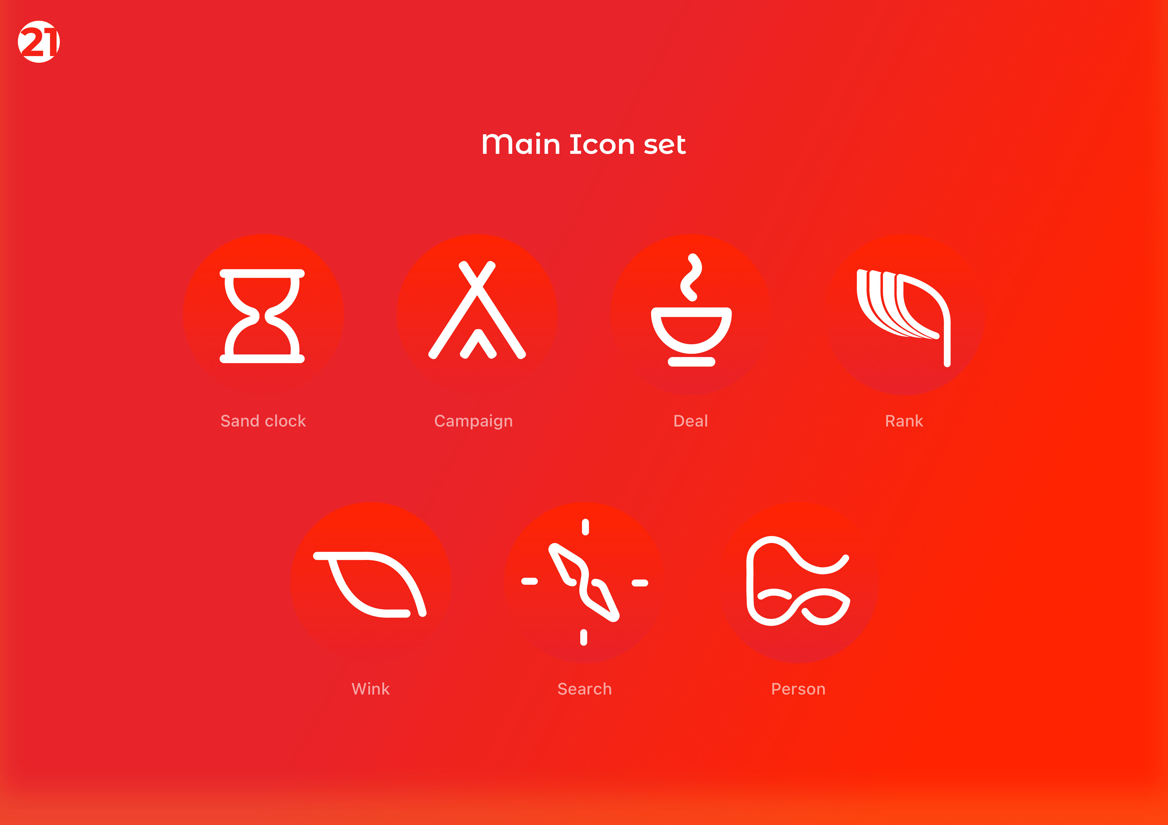
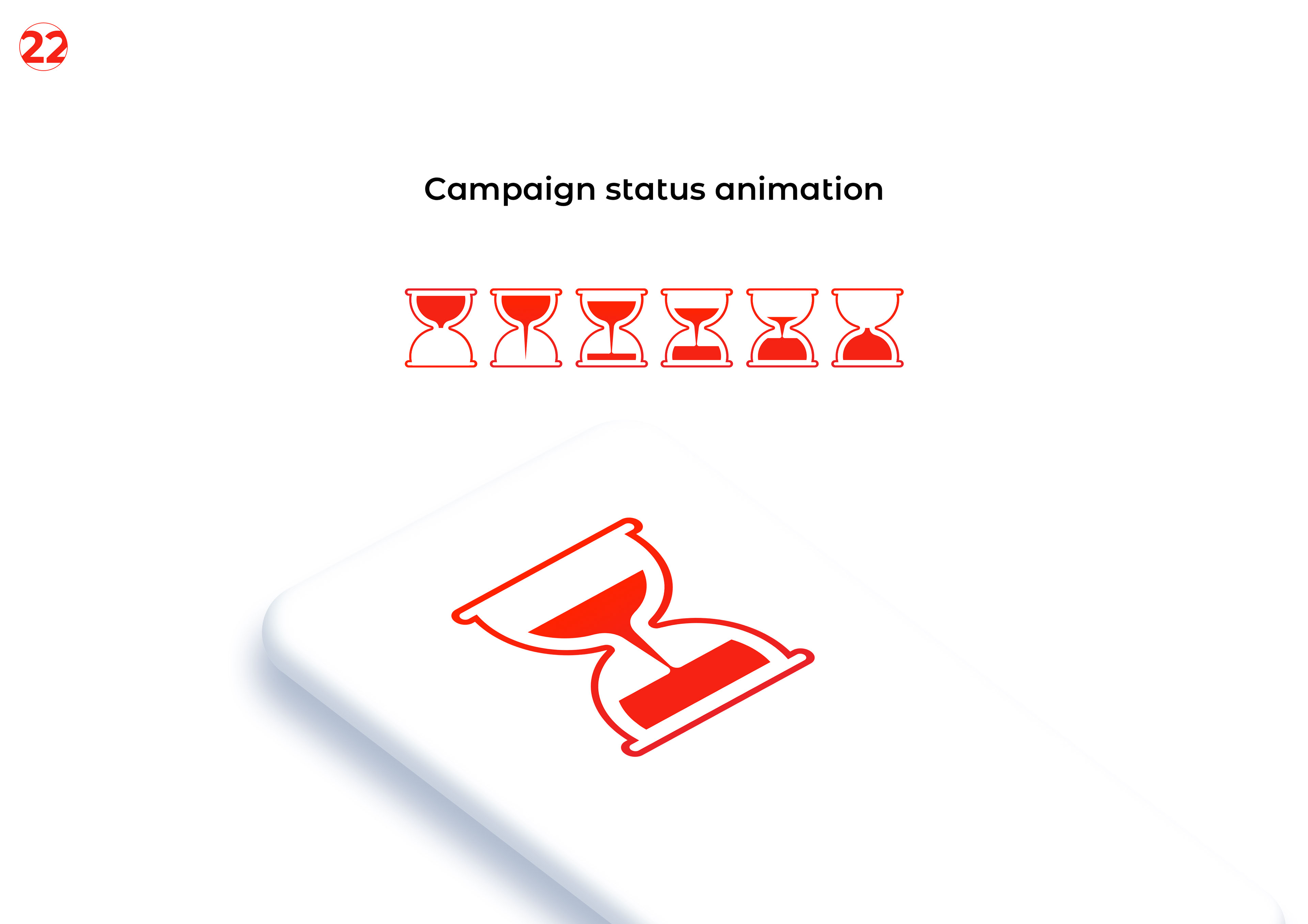
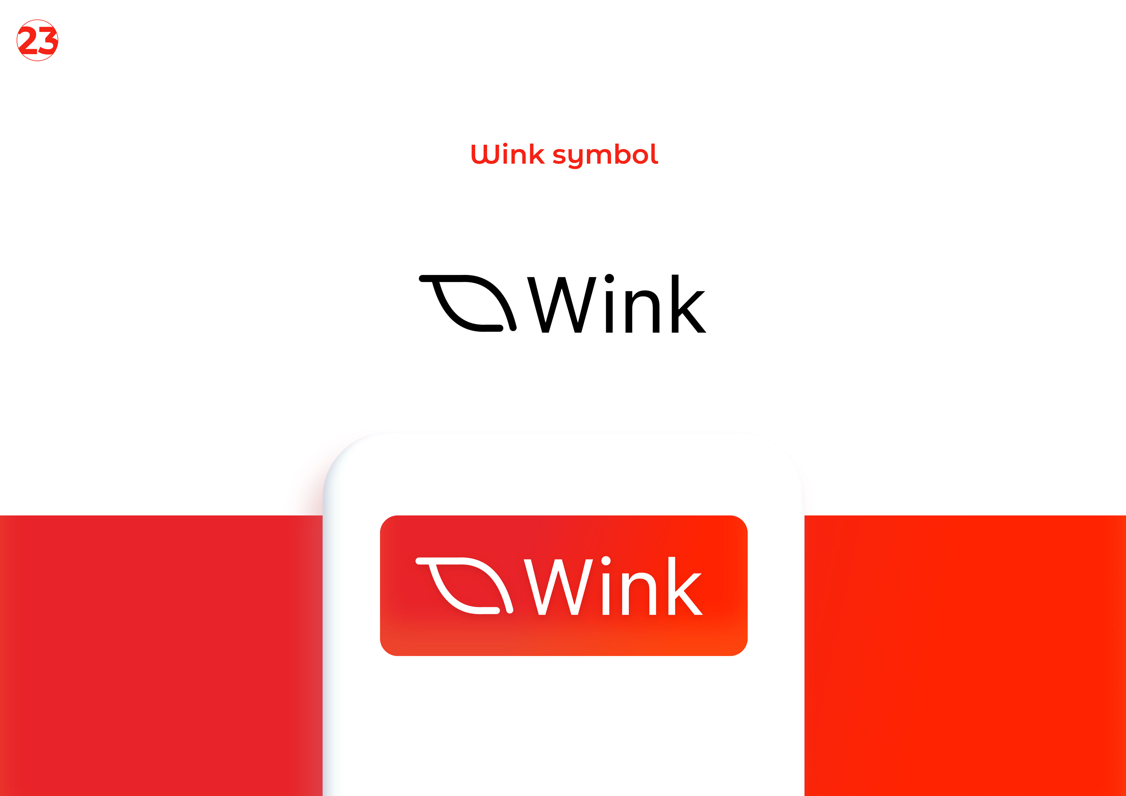
The wordmark was custom-drawn against the type system, not selected from a foundry. Every curve carries a reason that the team can defend in front of a partner.
We delivered a direction document, not a stock library. The team commissions photography against the direction, which keeps the visual library specific rather than generic.
The brand book is short, structured, and operationally direct. There are no inspirational spreads. Every spread answers a question the team will have on a Tuesday.


Visual system
Stock photography
Spreads
Send a short brief — we'll reply with concrete next steps. New engagements are limited each quarter.