M01operating reliably across the full seasonal catalogue
1
Site
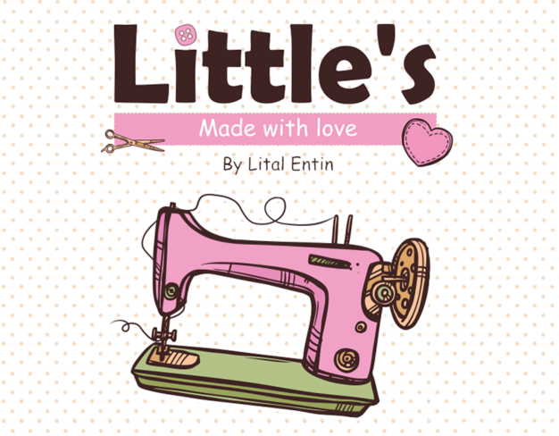
Littles is a children's brand whose previous digital surface had treated the audience the way most children's brands do — bright, soft, slightly condescending.
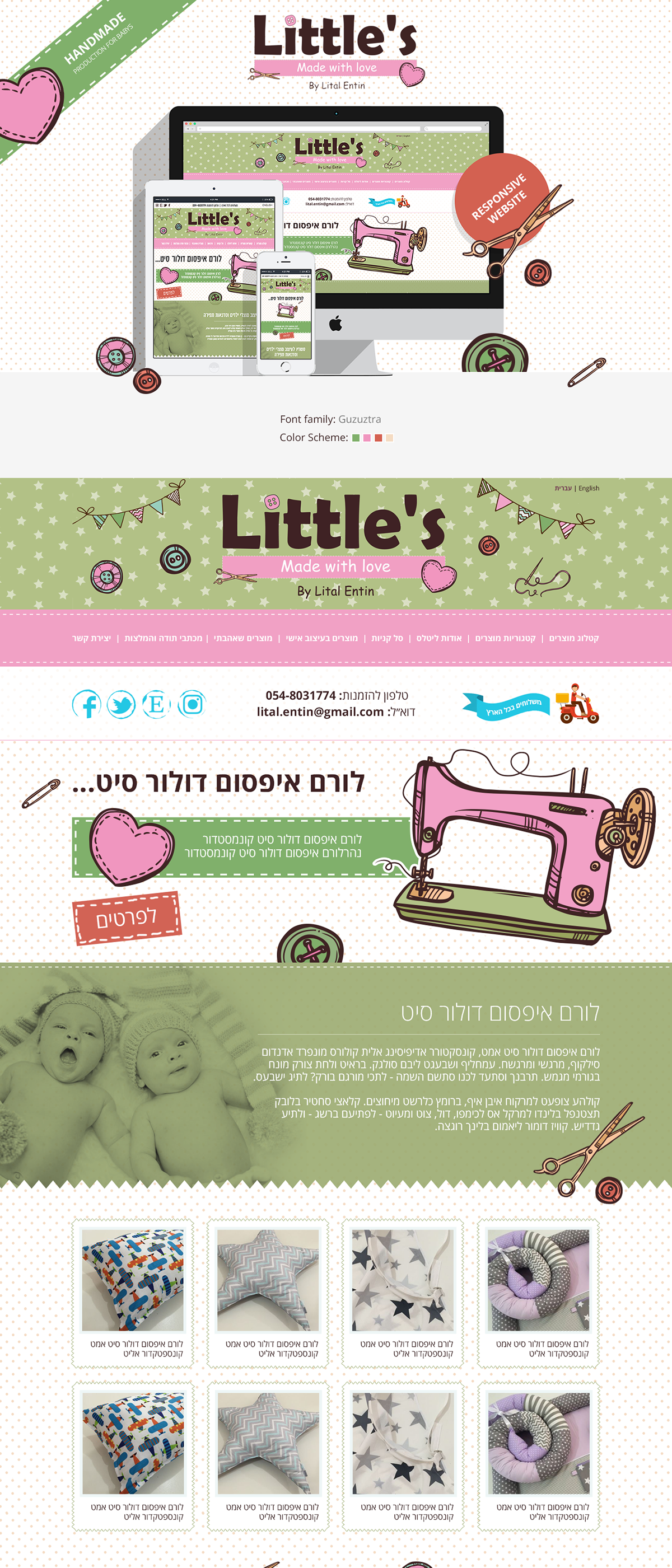
The brief was a UX and UI rebuild that took the audience seriously without losing the warmth that defines the category. We treated the parents and the children as two distinct audiences with one shared surface: parents make the decision, children form the impression. The visual system is calm enough for the parents and rich enough for the children, and the catalogue navigation finally reflects how the audience actually shops.
Parents and children share a surface. The system carries the warmth the children expect and the calm the parents need without choosing one at the cost of the other.
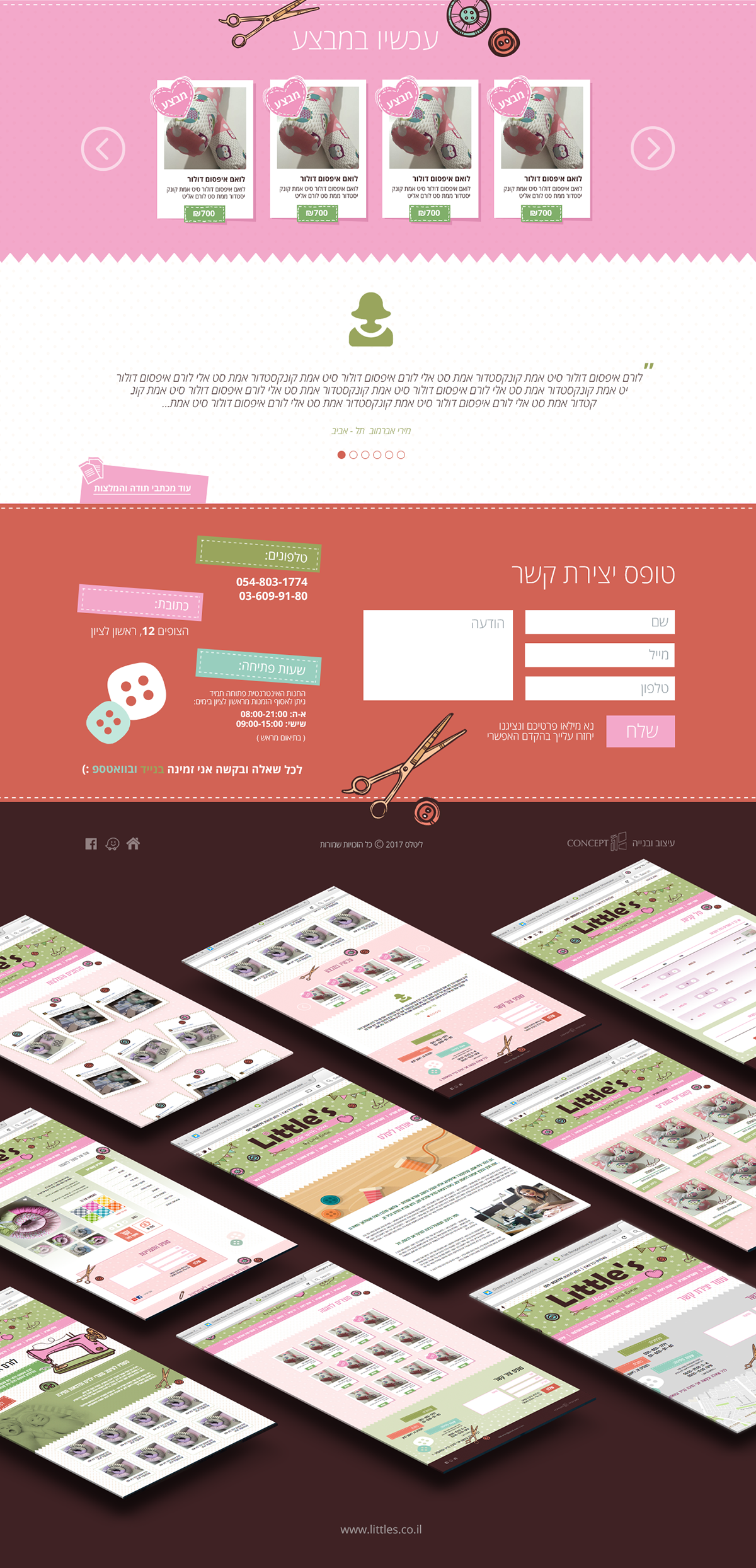
The information architecture starts from how the audience shops, not from how the catalogue is internally structured. Browsing feels like the parent's mental model, not the merchant's.
Site
Time on category
Send a short brief — we'll reply with concrete next steps. New engagements are limited each quarter.