M01applied across signage, wayfinding, and event collateral
1
Visual system
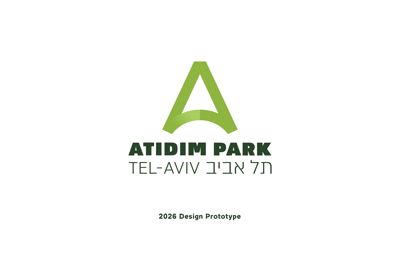
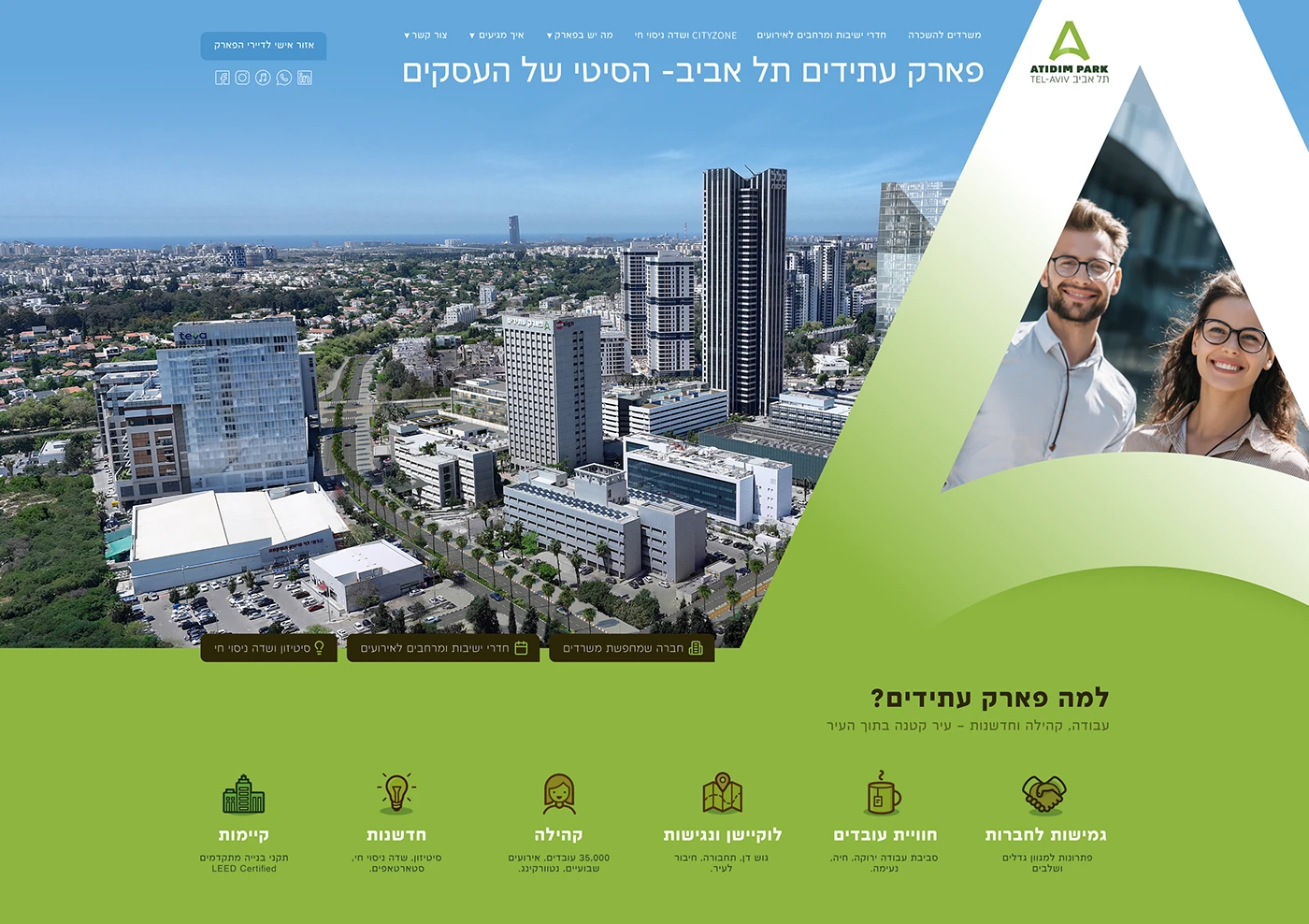
Park Atidim is a business park in north Tel Aviv whose public-facing identity had never caught up with the calibre of the tenants inside it.
The brief was a brand system that could carry signage, wayfinding, and event collateral without leaning on the usual Tel Aviv visual shortcuts — skyline silhouettes, Bauhaus pastiche, gradient blues. We built a restrained system around strong typography, a single accent, and photography direction that treats the campus as architecture rather than as a lifestyle backdrop. The result is an identity the operator can extend without our involvement.
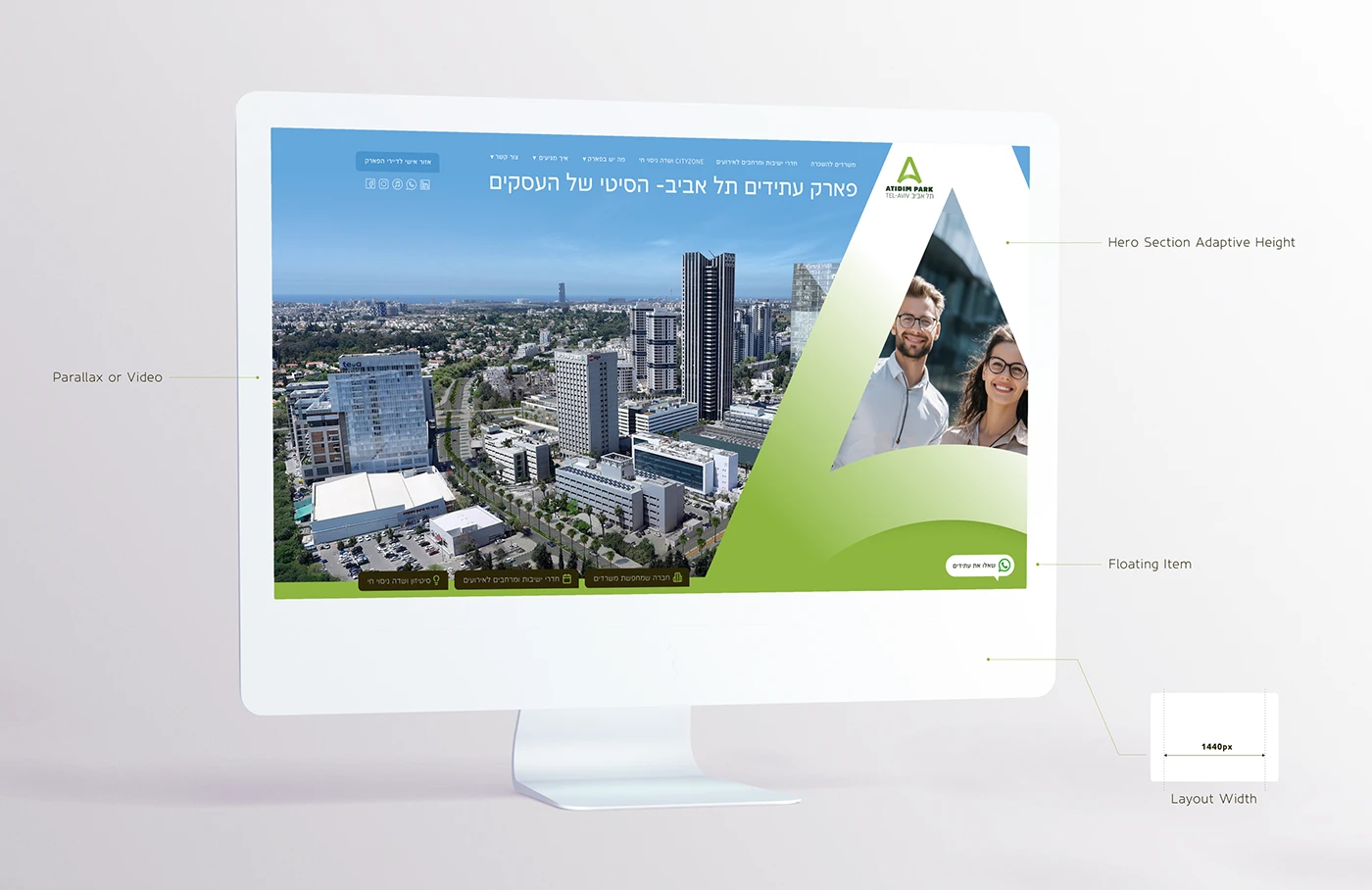
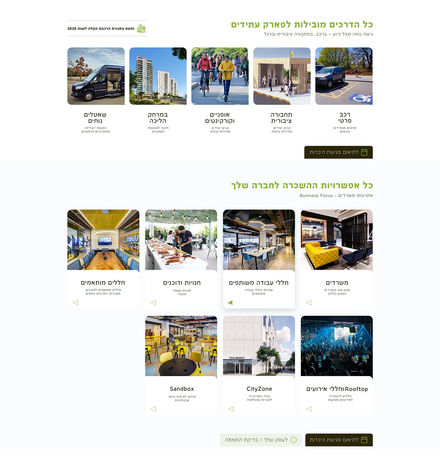
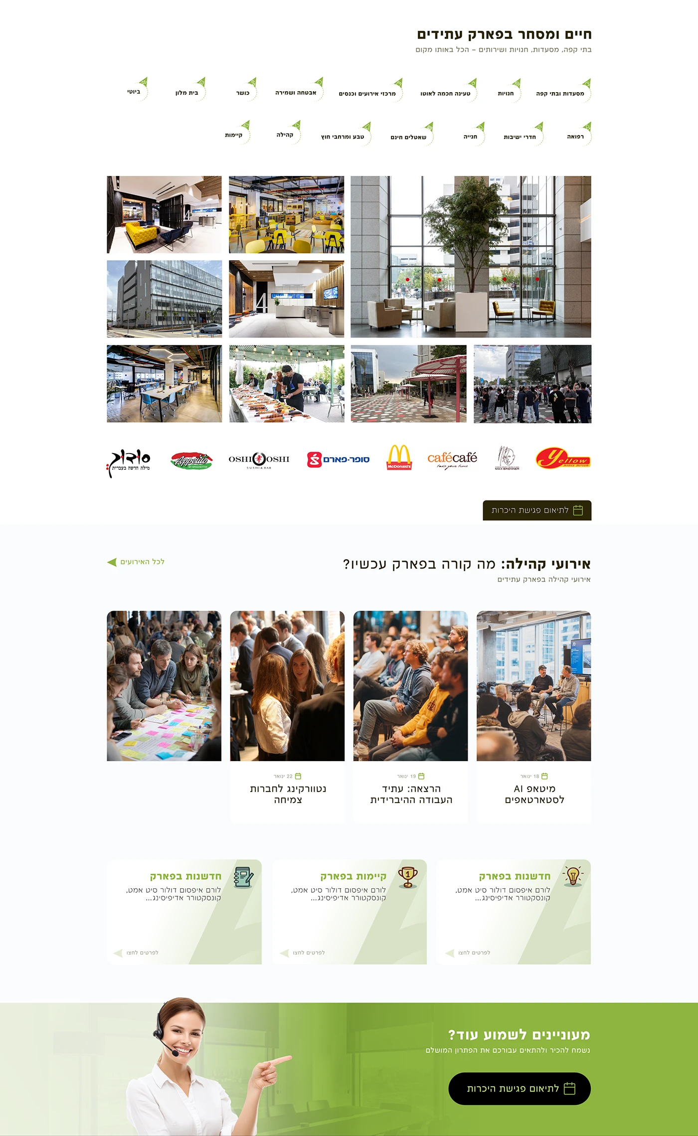
The system anchors on type and spatial rhythm rather than illustration. Every application reads as part of the same campus, not as a one-off poster.
Signage templates, event formats, and digital banners share one grid and one typographic voice. The operator extends the system without submitting pieces for review.

Visual system
Core applications
Send a short brief — we'll reply with concrete next steps. New engagements are limited each quarter.