M01post-relaunch, in the first two months of live traffic
+62%
E-commerce conversion
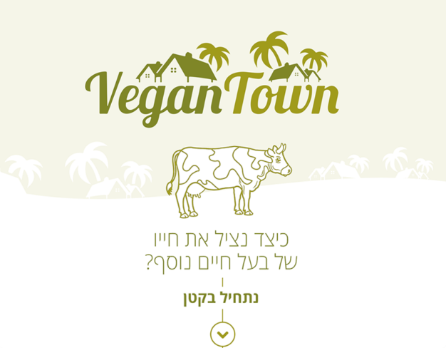
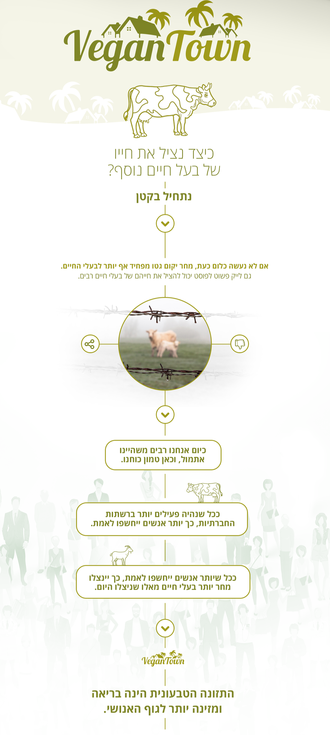
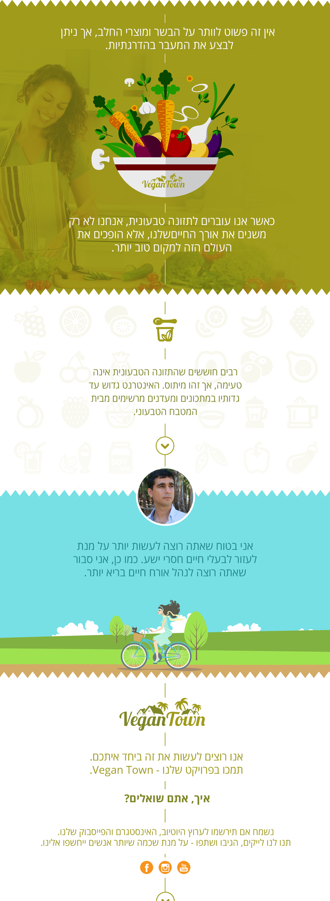
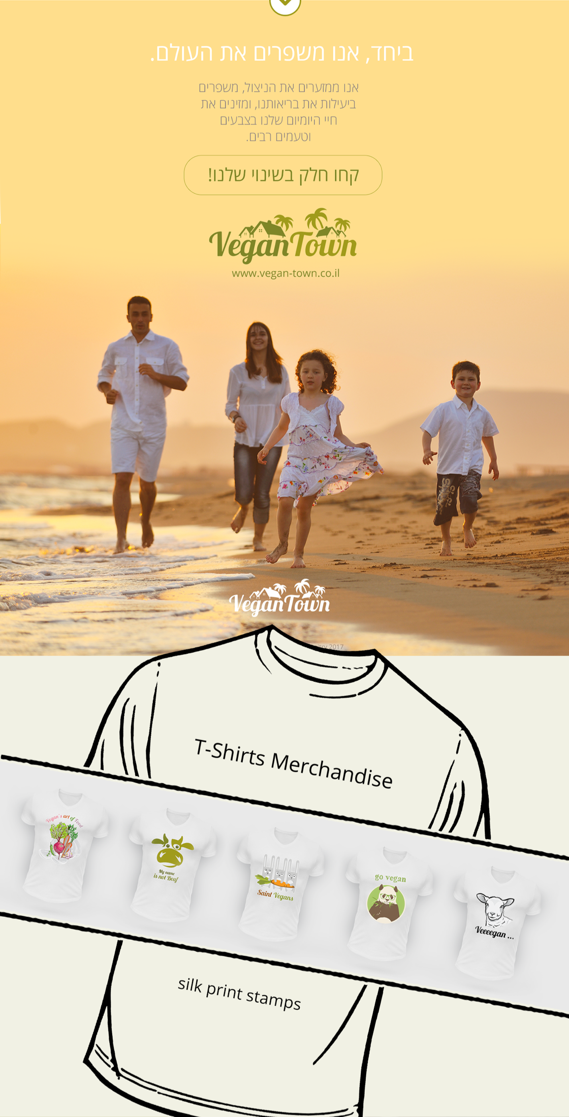
Vegan Town is a small but ambitious plant-based grocery operator with a serious product line and an identity that was actively undermining it — green leaves, sans-serif friendliness, the entire visual vocabulary of the segment they were trying to outgrow.
The brief was a brand and digital relaunch that would let them pitch to retail buyers and serve direct customers without flattening the catalogue into a sea of identical wellness signifiers. We pushed in the opposite direction of the category: a typographic system built on a strong serif, a controlled color palette dominated by deep paper tones rather than greens, photography direction that treated the products as ingredients rather than lifestyle props. The website was rebuilt as an editorial commerce surface — readable product pages, a recipe section that earns its place, a checkout that actually closes. The result reads premium without performing premium, which is the trade the founders had been trying to articulate for two years and could not find a partner to execute.
The core decision was to refuse the visual shortcuts of the segment — leaf marks, gradient greens, hand-drawn ingredient illustrations. Instead, the system anchors on a strong serif, a controlled palette of paper neutrals and one deep accent, and product photography that treats food as composition rather than as a lifestyle prop. The brand reads as serious enough to belong in a real grocery aisle.
The site is a Next.js front end on top of a headless commerce stack. Product pages are designed to be read, not just scanned: ingredient stories sit alongside the buy-box, and the recipe section is woven into the catalogue rather than quarantined to a /blog. Checkout is a single page with a single decision per row, which is the only meaningful conversion lever in DTC food and was treated accordingly.
Every brand primitive — type, color, spacing, photography direction — is documented in a 22-page operations guide written for a marketing team of two. The system is intentionally small enough to memorise. The founders update the site themselves and have not asked us to do so since handover.

E-commerce conversion
Wholesale inquiries
Retail partnerships
Send a short brief — we'll reply with concrete next steps. New engagements are limited each quarter.